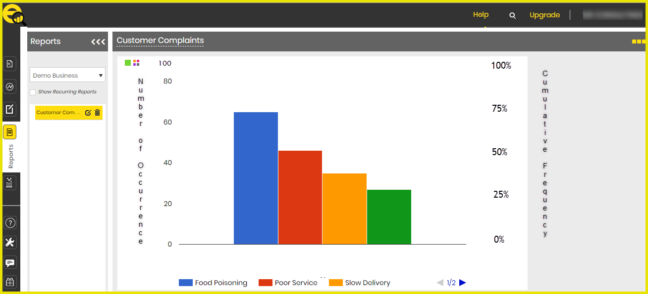
The Pareto Chart, which is a variation of the bar chart, is very useful for providing insights into key performance indicators (KPIs). It contains both bars and a line graph — the bars are displayed in descending order while the line represents the cumulative total.
The Y-axis of the chart represents the frequency of occurrence while the X-axis displays the categories being measured.

The Pareto Chart was designed by Vilfredo Pareto, an Italian engineer who made a number of important contributions to economic theory.
Often used to improve quality control, the Pareto chart highlights the most important factors in a data set. It can reduce project complexity by identifying the most important elements within a project.
80% of the outputs result from 20% of the inputs. - The Pareto Principle
In a quality control context, these charts are often used to determine where the greatest frequency of product defects are coming from or what the most common causes of customer complaints are.
However, it can be used in many other contexts and is beneficial for tracking various KPIs including sales, customer feedback, productivity levels, search engine optimisation results and much more.
It is a very useful chart for KPI tracking software because it allows a user to easily understand the individual total of specific groups and the impact of those groups upon the overall total. Pareto charts are also useful for answering questions like “Where is most of our revenue coming from?” because the user simply follows the cumulative total line to find the answer.
The Seven Basic Tools of Quality
The Pareto Chart is one of the tools included in the Seven Basic Tools of Quality. The tools are graphical techniques that are useful for troubleshooting issues relating to quality.
A number of these tools are particularly useful for displaying key performance indicators on performance dashboards, including:
• Pareto chart
• Cause-and-effect diagram (Ishikawa diagram)
• Check sheet
• Control chart
• Histogram
• Scatter diagram
• Stratification (flow chart or run chart)
The Project Management Institute references these tools as an important set of instruments for ensuring project quality. The benefit of these graphical techniques is that they are capable of displaying complex statistics while remaining easy to understand and comprehensible for people without formal training in statistics.
Using a Pareto Chart
The process for creating a Pareto Chart is quite simple. For example, follow this process when constructing a chart to represent customer complaints:
1. Select the categories you would like to group the items into
What are people complaining about? Slow delivery time, packaging issues, product quality, broken product, wrong product.
2. Determine the appropriate measurement for what you wish to communicate
What are you trying to convey with this graph? Number of complaints per category, the cost of each complaint, the number of calls for each complaint type, time spent dealing with the complaint?
3. Decide what period the chart covers
A financial quarter, a week, a year?
4. Collect the data and format into bar chart and add cumulative total line
Most KPI management software will format the data for you.
5. Determine the appropriate scale for the chart
You may have some display options to make the graph easier to understand.
In this situation, the chart will help the user understand where most complaints are coming from and what proportion multiple types of complaints make up. When there are many categories, it helps users immediately understand the overall significance of each group.

You could also use stacked bar charts to further increase the information conveyed by a Pareto chart. In the ‘customer complaints’ example, you could include geographical locations so a user understands where each type of complaint is coming from. They may realise that complaints about slow delivery come from a particular region.
Pareto charts are available for the performance dashboards of most KPI tracking software packages. The insight they can provide makes them a very useful tool.


One comment
Thanks for helping me to see things in a diernfeft light.
Leave a Comment